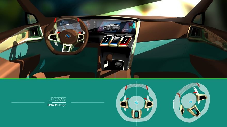
Buckle up, folks. BMW has released both design sketches and images of their forthcoming XM—a hybrid pairing an electric motor with a freaking V8–and it’s a doozy. I’ll show you the renders first, then get into some opinions.
Listen beautiful relax classics on our Youtube channel.

I think what’s happened here is, BMW’s design team has bludgeoned me into submission with their increasingly frenetic car designs and gigantic grilles, and has altered my expectations to the point where…I’m sort of warming up to this one. At the very least, it doesn’t bug me like the new iX does. I think that’s because the iX looked like its design team had internal arguments, with half the squad pushing gentle surface changes and the other half fighting for hard creases, and the resultant design was all over the place. With the XM, it looks more like the design was overseen by a singular designer.
There are still about 24 extra surfaces too many, but at least the gesture lines better relate to one another. I can’t call this design restrained—they’re going for a techno-aggressive kind of vibe—but it’s at least cogent. I feel Kia’s EV9 concept pulled off this “Westworld” look better, but there’s no denying this XM provides a better account than previous designs of the new direction that BMW’s going in, however strange.
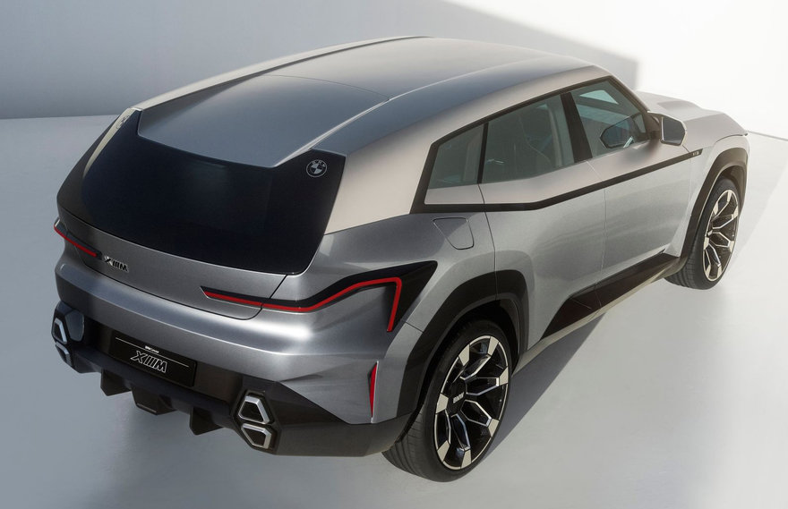
My comments above, however, relate to the renders and the design intent. Once we get down to the actual sheet metal, we can see the massive gulf between an expressive drawing and something that actually needs to be manufactured in real 3D space. The real car suffers for it. For instance, in side profile the beltline’s ambiguous direction doesn’t do the car’s proportions any favors:
Listen beautiful relax classics on our Youtube channel.
The beltline doesn’t look as terrible in 3/4 view…
…but that signifies another problem, no? I think a car’s got to look good from all angles. It’s the entire reason why car manufacturers go to the trouble of creating clay models. Recently I was at the launch of the new Range Rover, watching it spin on a turntable, and there’s not a bad angle to be had. That vehicle’s minimal lines are, for me, a good example of less is more.
The XM’s grille is still massive, but at least here they’ve ditched the buck-toothed proportions from their other models, so it looks less offensive.
The taillights are a bit much for me. They remind me of those performers who dance around with a long red piece of fabric tied to a stick.
I do find the exhaust ports kind of nifty.
This detail below I find kind of dissonant. The circular badge doesn’t seem to jive with the contours of the carve-out:
And the front corners of the car suffer the same way they do under most manufacturers. Why does this area always look like the designers are trying to bend the time-space continuum?
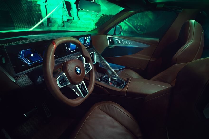
There’s something interesting going on in the interior. While the front seats and dash are about what you’d expect, leather and techno surfaces…
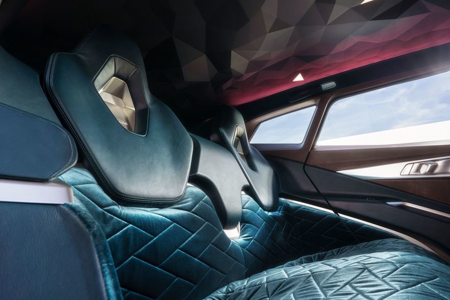
The backseat is downright strange. First off, it’s upholstered in velvet.
And the headliner is textured with polygons.
As for why–and to learn what the design brief was for this vehicle–this video of Domagoj Dukec, Head of BMW Design, and Frank van Meel, CEO of BMW M discussing the car is well worth a watch:
Source: core77


