Target’s logo is a target. Apple’s logo is an apple. What does BMW’s logo represent?
Listen beautiful relax classics on our Youtube channel.
Ask most designers, and they’ll say it’s a propeller. At design school, at least one of my professors told us that the Bimmer rondel represents a stylized propeller, since they started out as a manufacturer of aircraft engines.
However, “the truth is a little different,” explains Fred Jakobs, a man who ought to know; he’s the Chief Archivist of BMW Group Classic, the company’s historical branch.

When BMW got their start in 1917 yes, they were making aircraft engines, but the first place the general public was likely to spot the logo was on their R32 motorcycle in the 1920s:


As for where the blue and white quadrants came from, those were lifted directly from the flag of Bavaria, the region of Germany from which BMW originated:

As BMW grew and began taking out advertising, an unnamed graphic designer transposed the logo with the propeller of an airplane that BMW had created the engine for. Here we see the ad, which is from 1929:

Some years later, in a 1942 ad, the logo-as-propeller again popped up as a graphic flourish:

These ads cemented in people’s minds that the logo represented spinning blades, and “for a long time, BMW made little effort to correct the myth that the BMW badge is a propeller,” Jakobs says. “This interpretation has been commonplace for 90 years, so in the meantime it has acquired a certain justification.”
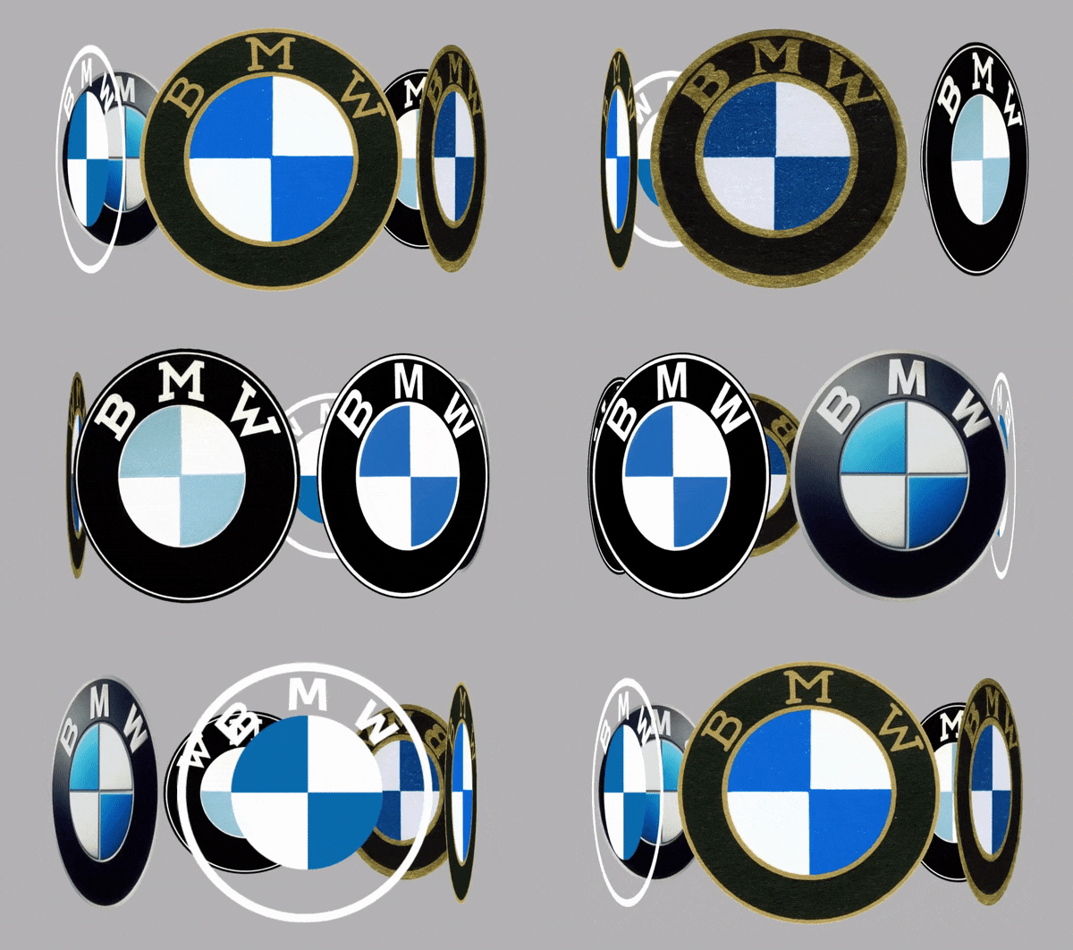
We bring all of this up because BMW recently redesigned their logo, the first time they’d done so in 23 years. If you look at the 1997 logo alongside the 2020 one, you’ll see they’re both emblematic of their eras.
In 1997 every designer on earth was wielding Illustrator with abandon, adding gradients to 2D forms in an effort to make them jump off of the page:
Listen beautiful relax classics on our Youtube channel.
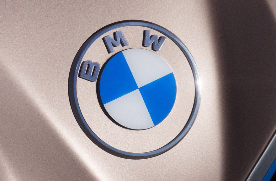
Here in 2020, the “fake 3D” aesthetic looks tired, and we’re back to the “flat” look that designers used when the creative options were limited. But the new flat, as championed by Apple and others, seeks to look clean and minimal:
“The new communication logo radiates openness and clarity,” says Jens Thiemer, BMW’s Senior Vice President, Customer & Brand. Furthermore, says the company, “The change reflects BMW’s transition from centering purely on the automotive world to being about technology and connections.” (This what-else-can-we-do thinking mirrors automotive industry chatter we’ve heard recently, like Toyota’s President stating that “Toyota itself is now trying to transition from an automotive company into a mobility company.”)
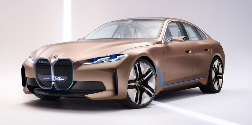
Worth noting: Although BMW’s new logo was unveiled this week on their Tesla-fighting i4 concept…
…it is not meant, at least for now, to actually appear on their cars. “It won’t be use on the vehicles or in the exterior and interior labeling our dealerships,” the company explains. “The existing logo remains in use there.”
The headlines I’ve seen about the new logo are misleading, giving the impression that this is the new on-car badge. If the propeller thing is any indication, BMW won’t go out of their way to correct the notion.
And if you want to see how the BMW logo has evolved over the years, here’s the graphic:
See Also:
– A Visual History of Corvette Logos
– People Trying to Draw Famous Logos from Memory, Part 1
– People Trying to Draw Famous Logos from Memory, Part 2
Source: core77


