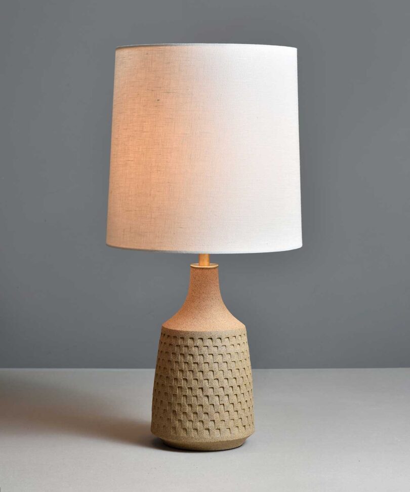
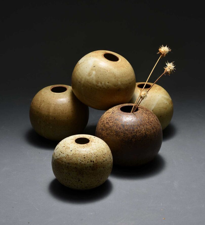
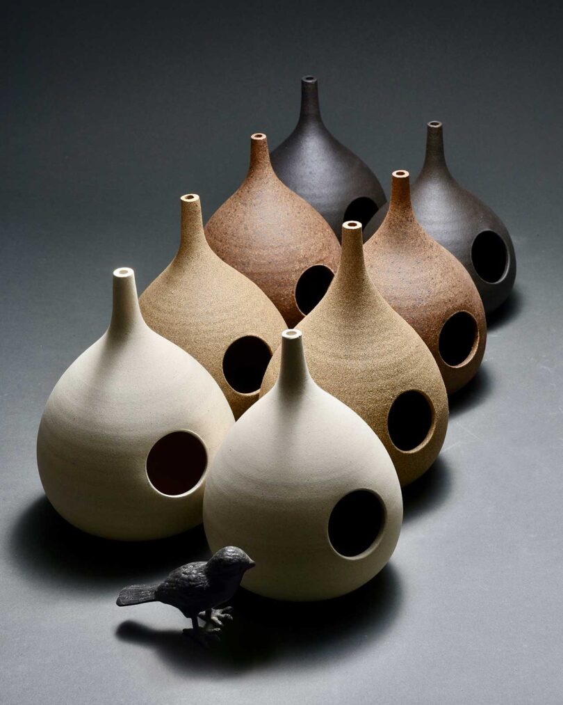
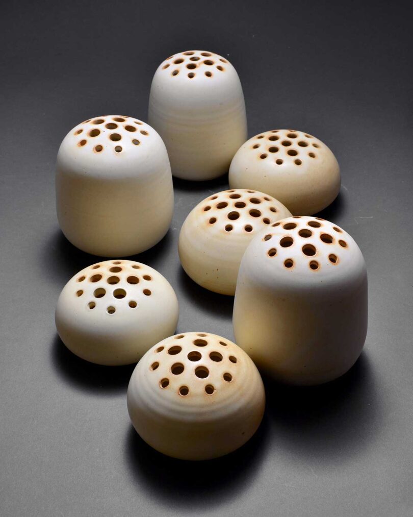
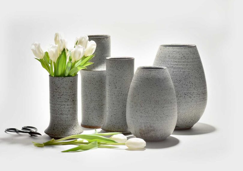
As a graphic designer, Bob Dinetz has worked for some of the world’s biggest companies – the ones in many ways determining how we spend our time: Apple, Adobe, The New York Times Magazine, and many more. Good graphic design, he says, is about boiling the brand down to its essence, and responding appropriately – and at that level, it shares certain similarities in his approach to his highly successful line of ceramics for the home: “A lot of times in graphic design, which I still do, it’s about distilling a problem down into the elements that are easily understood,” he says. “It’s about communication and clarity, and that’s what I’ve tried to bring to ceramics. A lot of the shapes I make are quite simple – they just have a few simple ridges or rims that react to glaze and to light. There’s quite a parallel between the work I do in graphic design and in pottery.”
Listen beautiful relax classics on our Youtube channel.
In this week’s Milkshake, Bob shares several pieces of his own, showing work that combines a patient yet experimental approach to color and glaze – one that’s perfectly suited to a practice like ceramics, in which happy accidents (and even some unhappy ones) can lead to aesthetic revelations. “For me, color is really the mixture of clay and glaze together – which sounds like an obvious thing, but it took me a while to figure it out,” he says. “Earlier on, I would think of glaze as just like paint – a treatment over a surface. But really, in the type of firing that my work is in, the clay reacts with the glaze and the atmosphere and the kiln, and [the color] comes through the glaze. What happened was one day I just mixed a glaze too thin, and a lot of the clay came through the glaze and it created an interesting effect. I learned over time to control that and refine it.”
Also in this week’s Milkshake, Bob shares the biggest challenges of his work – ”The setbacks that happen in pottery [are] pretty common, but take a while to get used to,” he says – as well as what he does to ensure that his art world expands rather than shrinks over time. (It involves Instagram) For that and more, tune in!
Diana Ostrom, who has written for Wallpaper, Interior Design, ID, The Wall Street Journal, and other outlets, is also the author of Faraway Places, a newsletter about travel.
Milkshake, DMTV (Design Milk TV)’s first regular series, shakes up the traditional interview format by asking designers, creatives, educators and industry professionals to select interview questions at random from their favorite bowl or vessel. During their candid discussions, you’ll not only gain a peek into their personal homeware collections, but also valuable insights into their work, life and passions.
Source: design-milk

