Listen beautiful relax classics on our Youtube channel.
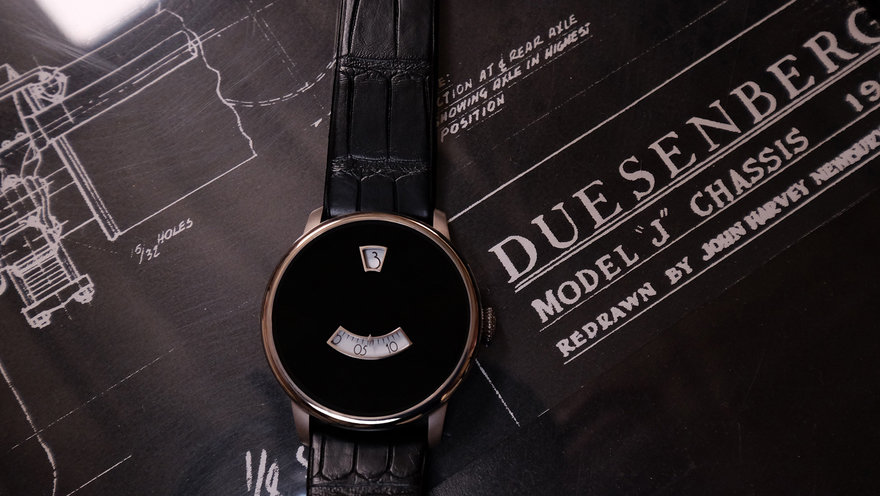
In Part 1 of this story, we covered how Jonathan Ward’s Duesey project came about and how he executed it. Ward tackled the design both as an industrial means of self-expression, and to correct what he saw as unconscionable design lapses in other objects in the category. Here in Part 2, Ward walks us through the design details of the finished product, revealing both his signature attention to detail and the extreme lengths he’ll go to for the sake of holistic, aesthetic satisfaction (see: Packaging). Folks, this is what thorough design attention looks like, and the lessons learned here could be applied to virtually anything within the realm of industrial design.
THE ICON DUESEY: DESIGN DETAILS
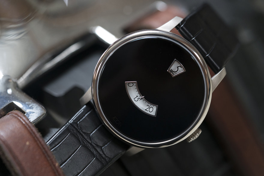
In the previous installment, Ward discussed the importance of the purity of design intent. Inspiration is required here, and the Duesenberg SJ, an early supercar designed during America’s Roaring Twenties, was a marvel of engineering and design that provided Ward with plenty of fodder. “I geeked out on the car’s details–the way the hardware attaches, the fenders to the body, that’s represented in the shape of the watch. The radiator cap inspired the radius and the shaping of the case.”
“I designed my own rotor, the perlage, the machine-turned finish, everything.”
“I struggled with this initially, but ended up laser centering ICON into the backside of the crystal. So if you’re face-on on the watch, you usually don’t see it….”
“…unless you have an odd angle of incoming light; then it shows up but is subtle, it doesn’t interrupt, doesn’t disturb the aesthetic flow.”
“The face is natural Onyx stone, laser cut, EDM’d, then hand polished.”
“I spent many hours on the crown. I find often they may look great, but suffer ergonomically. Alternately, they can be good ergonomically but bland by design. I spent many hours designing and refining this crown to strike the proper balance. It’s known as a “squashed onion,” it’s a popular style from the 1920s and ’30s.”
“The band is Italian calf leather, and stitchless; there’s no visual interruption for the pricking stitches. It’s all super detailed, skived, hand-formed and heat-creased around the edges.”
Listen beautiful relax classics on our Youtube channel.
“We used two different grades of titanium. A key client and friend is allergic to the more popular titanium used; it’s a rare allergy but it exists. So it’s T2 and T5 titanium. T5 is WAY harder to machine. The T2 used for the polish section gets a much higher quality polish to it than other varying alloys of titanium.”
“The silica finish you see below is traditionally never used on a classic-style watch, but I think it gives it a neat tweak. Technically that finish is considered self-healing because of the finishing manner, which I think is kind of bullshit. Though it does hide shit more.”
DESIGN DETAILS, CASE
Earlier Ward mentioned that the project took much longer than anticipated, and that he was largely to blame. Here he explains why. “In a storage attic here at the shop, I’ve got tons of different watch boxes. Almost regardless of the watch’s price point, sometimes it’s a cardboard box. A five digit watch and it comes in this cheesy generic box with a stamped gold foil logo. Lined with the ‘hyde’ of the elusive Nauga beast. Just no consideration.
“Or it’s something like a Patek, with gorgeous handcrafted inlaid hardwood, but it’s…a box. It’s that big”–here he uses his hands to trace the size of a chessboard–“for one watch, and once you take the watch out, it’s useless. What are you going to do with it? It’s a boat anchor.
“So I geeked out on the case, and that turned into a shit show. I went through three different suppliers until I could get what I was envisioning, done right.”
Here’s what Ward came up with:
“We found a piano finisher in Austria who could do the true black lacquer on hardwood to the spec that we wanted…”
“…and then design these blind elbow hinges and the laser cut stainless perimeter.
“The box was fun to do. The idea was, I wanted it to remain relevant and to maintain its utility. So initially it’s a presentation box, and your watch is “Ta-da….”
“….But then you remove the ta-da tray and it’s a five-pillow watch box.”
“So it has value daily and keeps the brand in front of the client’s face. And then hopefully, as I continue to develop and release more watches, it inspires him to fill up the rest with ours.”
“$250,000 watches don’t have this level of consideration in the packaging.”
“And then we did that spun pewter lizard that we use on Icon vehicles’ horn buttons. He’s inlaid on the top deck of it.”
Another opportunity to take things all the way came in the form of the owner’s documents.
“I developed my own typeface for the watch, and it’s consistent everywhere on the watch,” Ward explains. “So I realized, shit, if I’ve gone that far, that font’s got to be on all the care-and-feeding instructions in the watch box. And if I’m going to do that, the outdated press-printing and blind foiling and all that is a super cool lost art. So then I found a supplier who still does it that way.”
“I find that with a lot of watch packaging, with the typeface and art direction, there’s just no consideration. Or you buy a high-end watch and it’ll have directions for shit that isn’t on the model you bought, that kind of stuff. So this isn’t anything crazy, it’s just a personal welcome letter to each client and the ownership docs, but it’s really thought through.”
“The owner card is the same as the ID cards, which are military placards, that we use for marking Icon’s production models. So I took the same thing and just changed out the art.”
“The headings are the same font that was designed for the watch. I changed the body text for legibility and differentiation, but the kerning and everything’s fucked with. I love this font, it came out really cool. It was such a fun project.”
Ward produced just 50 Dueseys. Watch 01/50 is on his wrist. A further 37 were sold. 39/50 thru 50/50 are waiting patiently in those cases, and Ward can’t wait for them to go: “I already have the two next designs locked and loaded, but my wife [Jamie, Icon’s COO] is far more prudent than I, so she won’t let me start on the next one until the remaining 12 are sold. But I’m chomping at the bit.”
________________
Up Next: How Ward got into the position to design whatever he wants, without compromise, and the other areas of design he’d like to see Icon expand into.
Source: core77


 “I find that with a lot of watch packaging, with the typeface and art direction, there’s just no consideration. Or you buy a high-end watch and it’ll have directions for shit that isn’t on the model you bought, that kind of stuff. So this isn’t anything crazy, it’s just a personal welcome letter to each client and the ownership docs, but it’s really thought through.”
 “The headings are the same font that was designed for the watch. I changed the body text for legibility and differentiation, but the kerning and everything’s fucked with. I love this font, it came out really cool. It was such a fun project.”