I guess it’s no surprise that Apple is ahead of automakers on the design curve.
In 2013 Apple rolled out the “flat” design aesthetic, deeming it the right choice for a mobile OS at the time. Six years later they’ve grown bored with it, and recent news revealed that their UI design aesthetic is moving towards neumorphism. For Apple, flat is dead.
Listen beautiful relax classics on our Youtube channel.
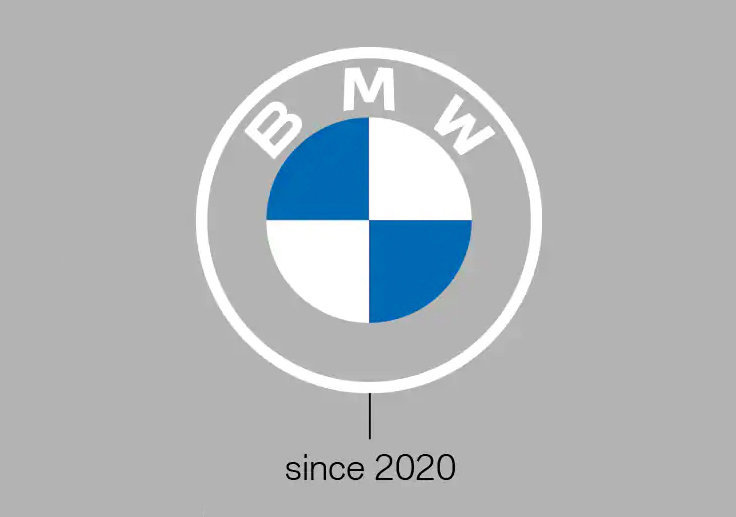
Car manufacturers, it seems, are 1-2 cycles behind. In March of this year BMW announced a logo change, moving from a stylized 3D logo to, you guessed it, flat.


Just a month later, Volkswagen followed suit.


This month Nissan announced their late arrival to the flat party, going with a logo redesign in “a simplified, lighter form that’s easier to identify and is designed to live flexibly in both the physical and digital worlds.”


That same week, Toyota announced they’re going with a flat logo as well, initially in the European market. Their wording was very similar to Nissan’s: “Toyota’s new brand logo distils its emblem to a simple 2-D design…it communicates simplicity, transparency and modernity and is perfectly adapted to the digital space but equally effective in the physical world.”


While automakers are probably fine with being behind Apple in terms of design trends, they’re definitely not fine with being behind their competitors. I’d expect to see a wave of logo changes in the coming year.
Source: core77