Struggling to remember or make sense of complicated information? Maybe a visual makeover with an eye-catching chart or graph will help! And if you have doubts about its effectiveness, allow us to introduce you to a subreddit called “Data Art”. It’s a community dedicated to sharing “aesthetically satisfying data visualizations that you’d be proud to hang on your wall”.
Since its creation in 2017, “Data Art” has grown into a thriving community of over 65 thousand members who share passion for blending aesthetics and data. From evolution of the Shanghai Metro to the largest empires of history, these visualizations are not only informative but also pleasing to the eye. Scroll down to experience the beautifully presented data.
Listen beautiful relax classics on our Youtube channel.
#1 How Different Piano Notes Reverberate Through A Bowl Of Water
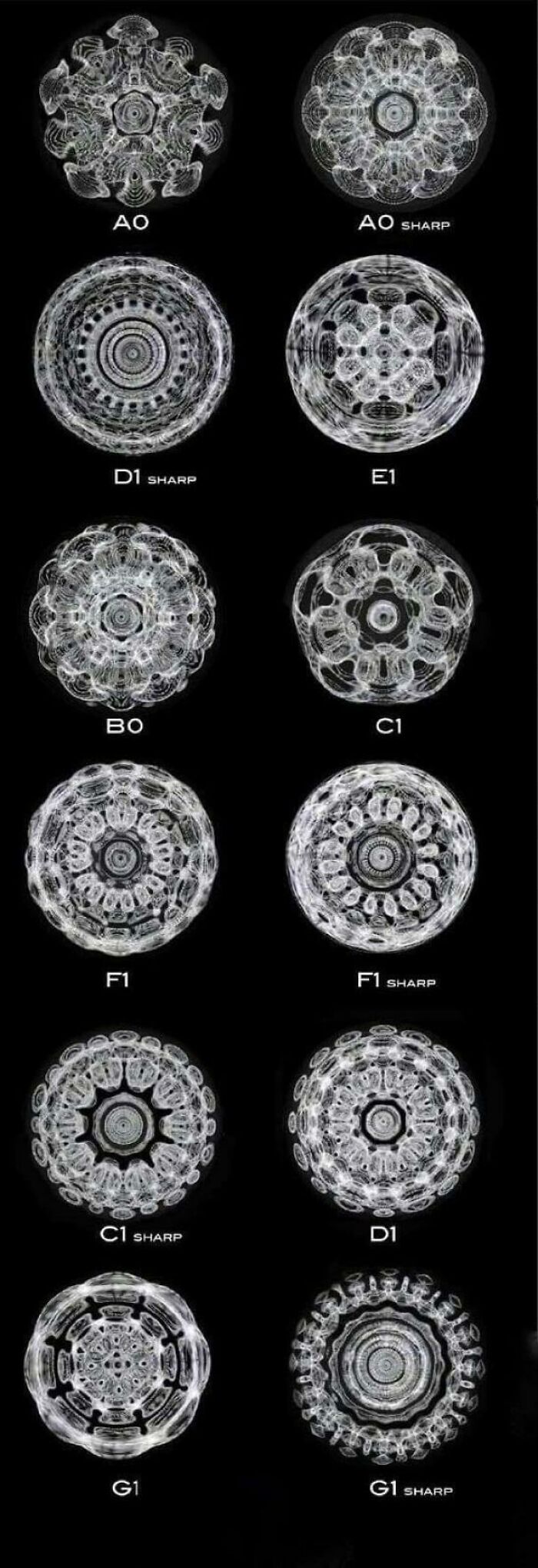
Image credits: KareemPye
#2 Paths Of 800 Unmanned Bicycles Being Pushed Until They Fall Over

Image credits: LatterLock
#3 European Roads To Rome
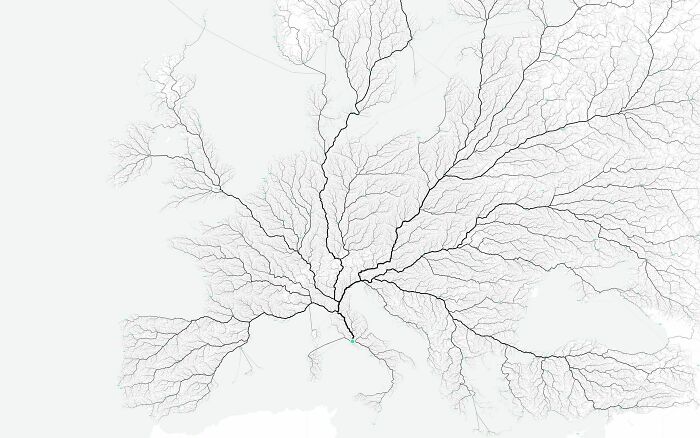
Image credits: jmerlinb
In today’s world full of information, there’s one field that stands out in its ability to unlock hidden secrets in huge amounts of raw data—data science. It has become the backbone of many industries, changing the way we see and interact with the world. Thanks to data science, we can make smart decisions, solve difficult problems, and discover patterns that were previously invisible to us. But what makes this field truly fascinating is data visualization. It beautifully merges analytics with aesthetics, helping us understand complex information better.
#4 U.S. Flag But Each Star Is Scaled Proportionally To Their State’s Population, In Roughly It’s Geographical Position

Image credits: jmerlinb
#5 All These Countries Fit Inside Africa
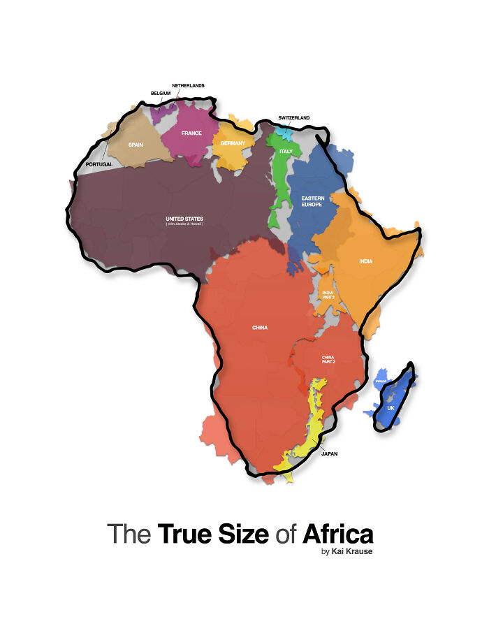
Image credits: jmerlinb
#6 Every Lighthouse In Ireland, With Accurate Timings, Flash Patterns And Colours
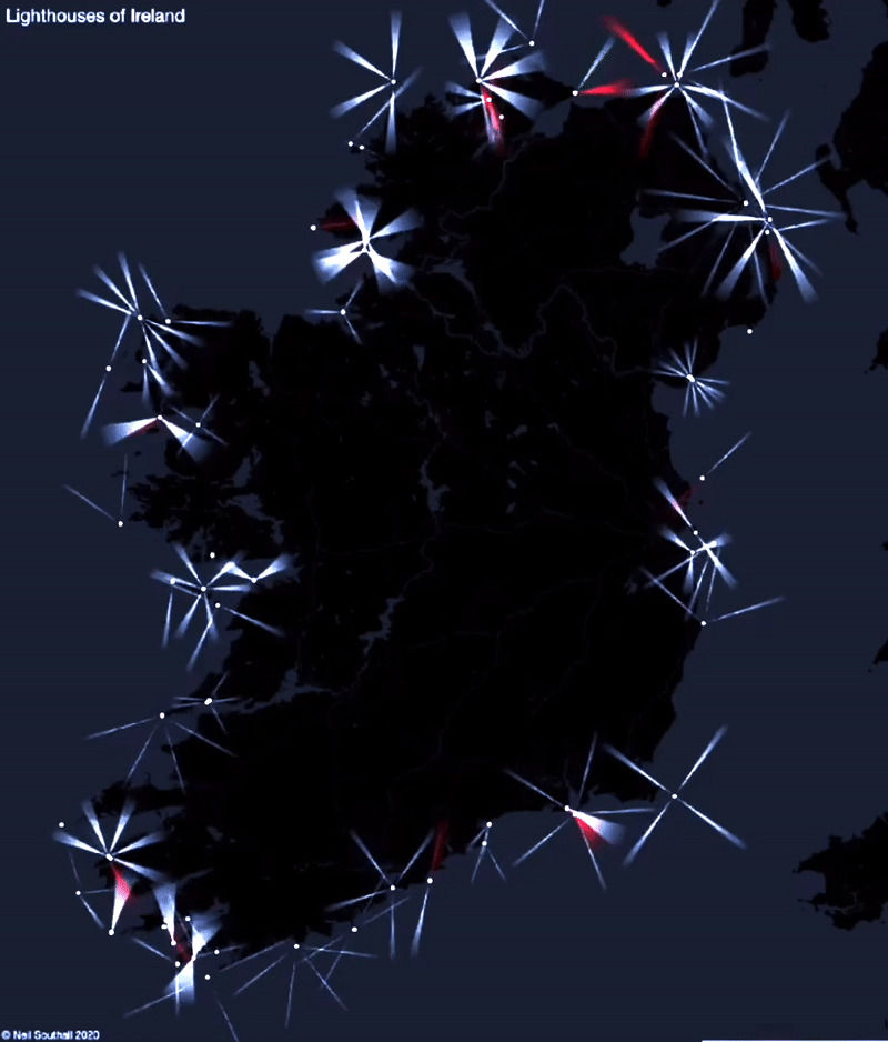
Image credits: jmerlinb
Data visualization is the art of transforming numbers, statistics, and abstract or difficult concepts into gripping representations. From captivating charts and graphs to interactive maps and cool infographics, data visualizations are the storytellers of the digital age. Every color, design, and arrangement in these images can grab our attention and teach us something. It’s a whole new way to show and tell!
#7 Hey Jude Lyrical Composition [oc]
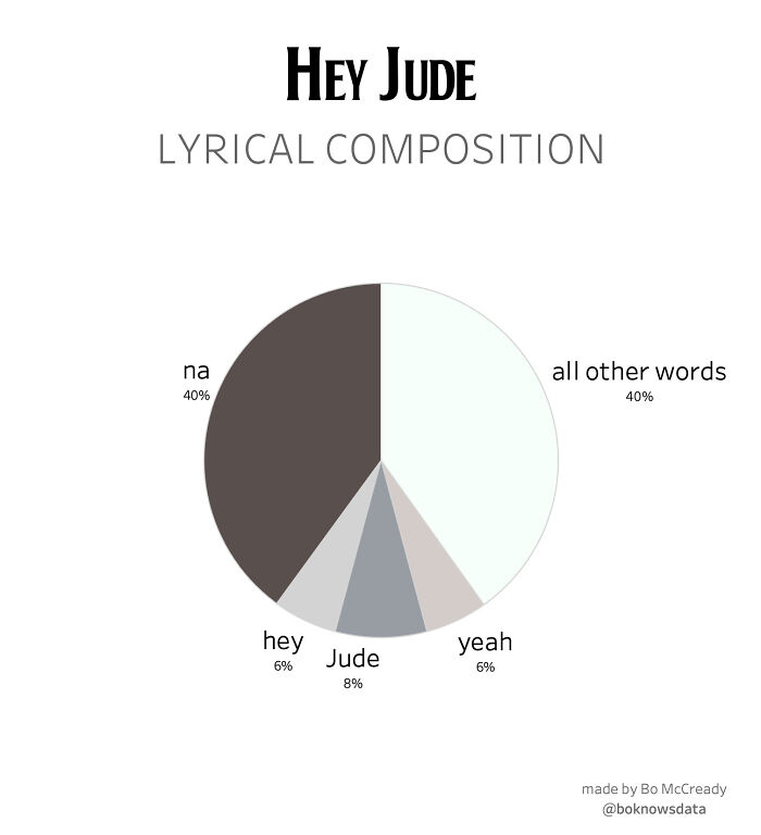
Image credits: BoMcCready
#8 This Map Is Drawn Entirely From Shipping Logs From 1945
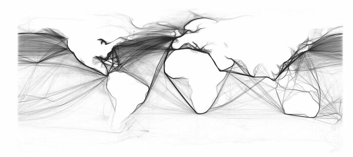
Image credits: jmerlinb
Listen beautiful relax classics on our Youtube channel.
#9 Long Exposure Of A Roomba Vacuum With A Color Changing Light On Top

Image credits: zoliva
The subreddit “Data Art” has become really popular over the years. When r/DataArt reached 10,000 subscribers, the moderator u/jmerlinb decided to personally send out a DataVizDigest email summarizing the top posts of that season every 3 months. “Because data should not only be informative, but also beautiful.” If you’re interested, you can sign up for their mailing list. Also, make sure to check out the most upvoted posts on the “ArtyCharty” Twitter page!
#10 Nyt’s Front Page For 21 Feb. Each Dot Represents A Life Lost To Covid-19 In The Us
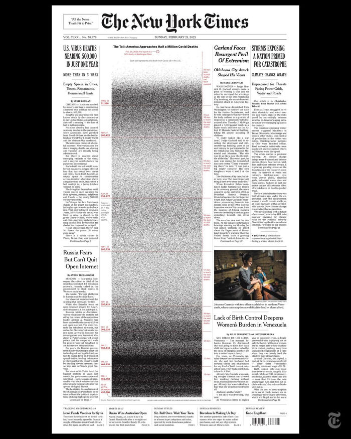
Image credits: sendhelpandthensome
#11 Literal Art!
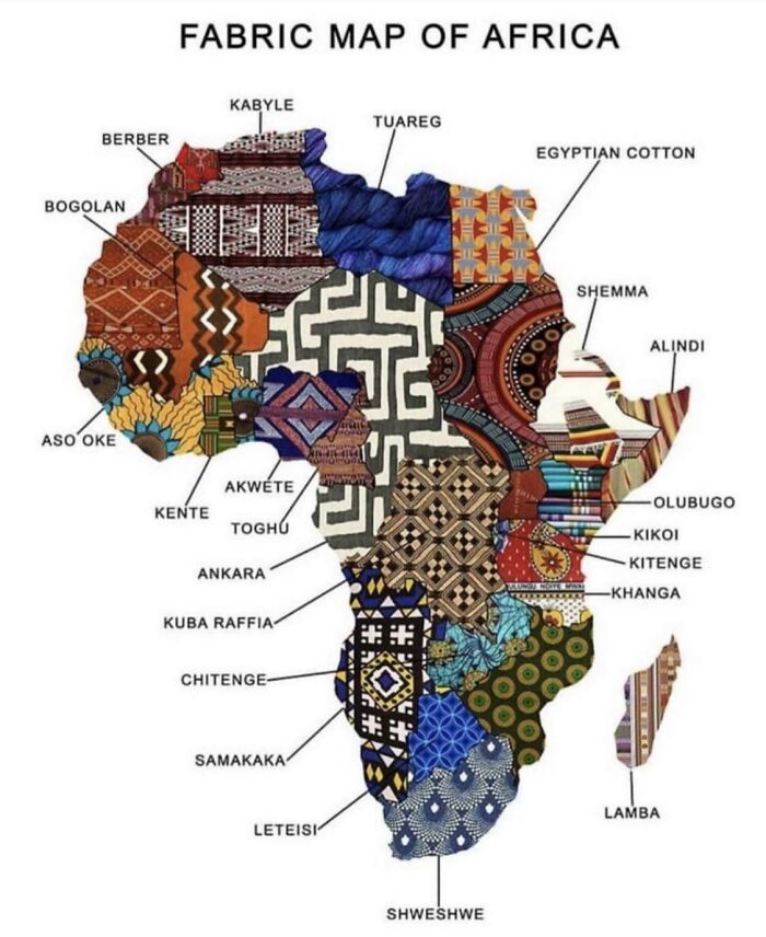
Image credits: Rosa-Asterwolf
#12 Wow!!!
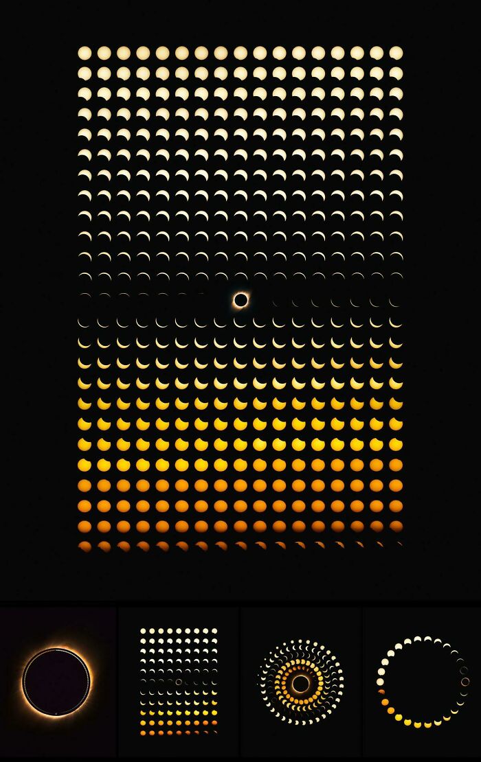
Image credits: akasaiga
According to the moderators of “Data Art”, the subreddit is about quality over quantity. “Our content is concerned; as such, we have a hard anti-spam policy and will not hesitate to remove content deemed to be spam.”
The subreddit allows sharing data visualizations or information designs only, so posts made in Excel are not welcome. However, the moderators noted that there is a history of data visualization practitioners pushing Excel to its breaking point and, in the process, creating amazing and well-designed visualizations. “These types of posts are more than welcome. We just want to avoid bog-standard, pre-set colored charts and graphs (and the dreaded scourge of Excel’s 3D pie charts).”
#13 Smarties Colour Distribution

Image credits: Koljax
#14 [oc] I Rendered Every Single Road In Tokyo Area On One Map. Love The Results
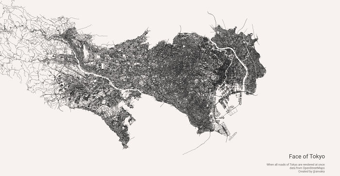
Image credits: jmerlinb
#15 How To Build A Human

Image credits: jmerlinb
#16 History Of The Mississippi River, As Drawn In 1944
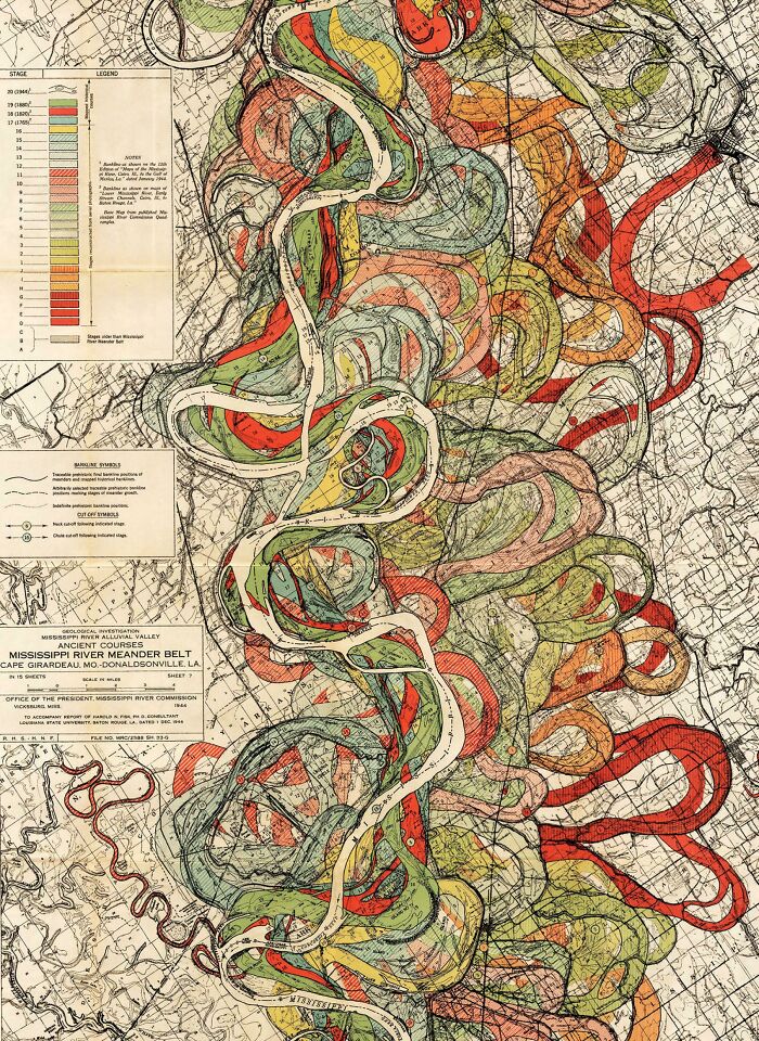
Image credits: jmerlinb
#17 Anatomy Of The Human Body, In The Style Of The London Underground Map
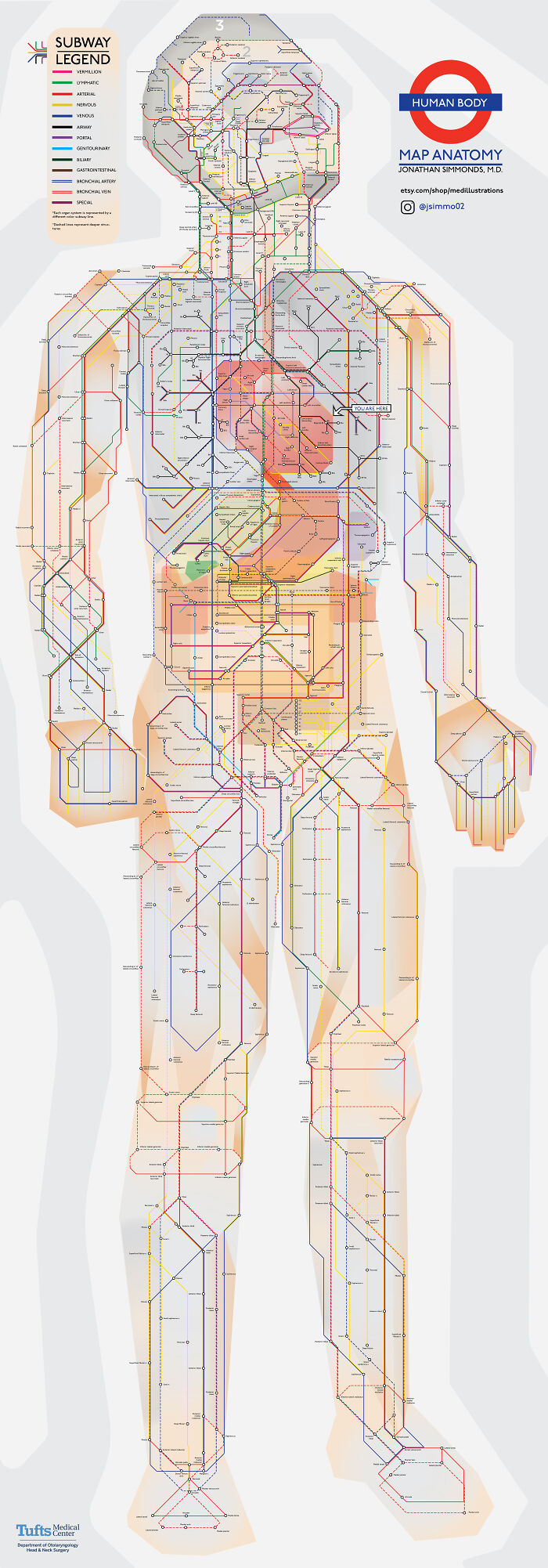
Image credits: jmerlinb
#18 [oc] This World Map Is Made Of Only Air Currents. If You Look Closely, You’ll See Country Outlines
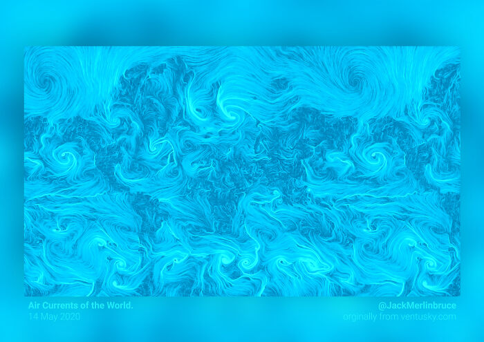
Image credits: jmerlinb
#19 This “Photo” Of The Sun Uses Neutrinos Instead Of Light, And Is Taken At Night By Looking Through The Earth

Image credits: jmerlinb
#20 A Map Of Finland’s Bear Population, Made Up Of Bears
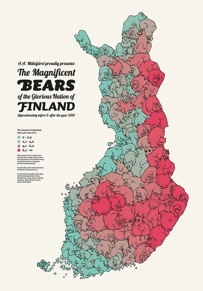
Image credits: jmerlinb
#21 Language Family Tree
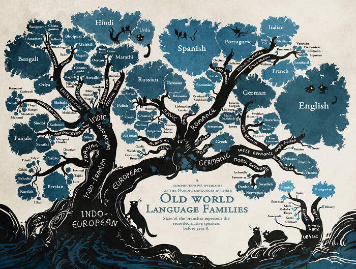
Image credits: SalvaDali22
#22 Lat And Long Data Of Every Town In The World With More Than 1000 People
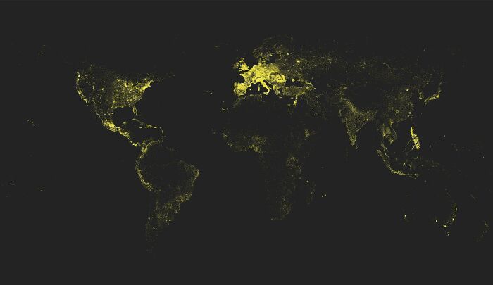
Image credits: black_red_ranger
#23 World Temperature Anomalies [oc]
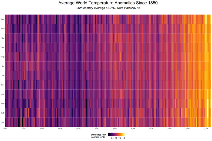
Image credits: cavedave
#24 139 Years Of Global Temperatures Knit Into A Baby Blanket
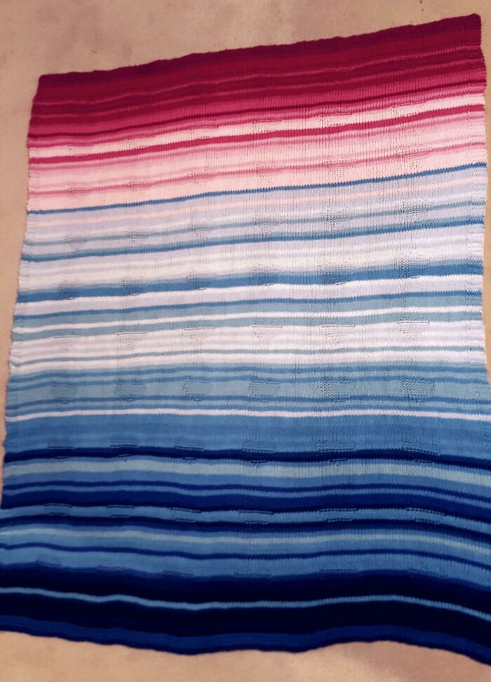
Image credits: itsacalamity
#25 90 Minute Public Transit Commuter Zone For London vs. San Francisco
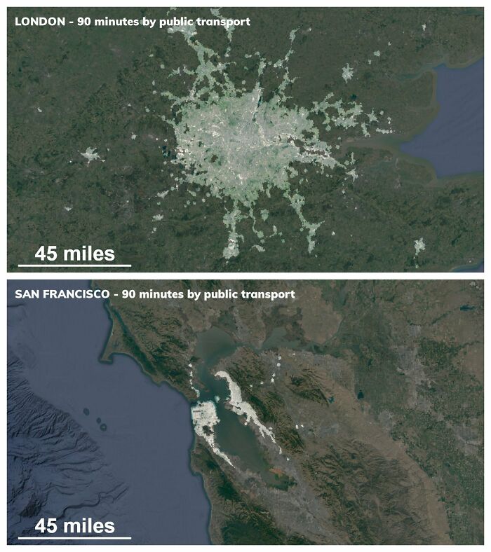
Image credits: ProfoundDonut
#26 (Some Of) The Largest Empires Of History, Visualised As Planets Orbiting Earth
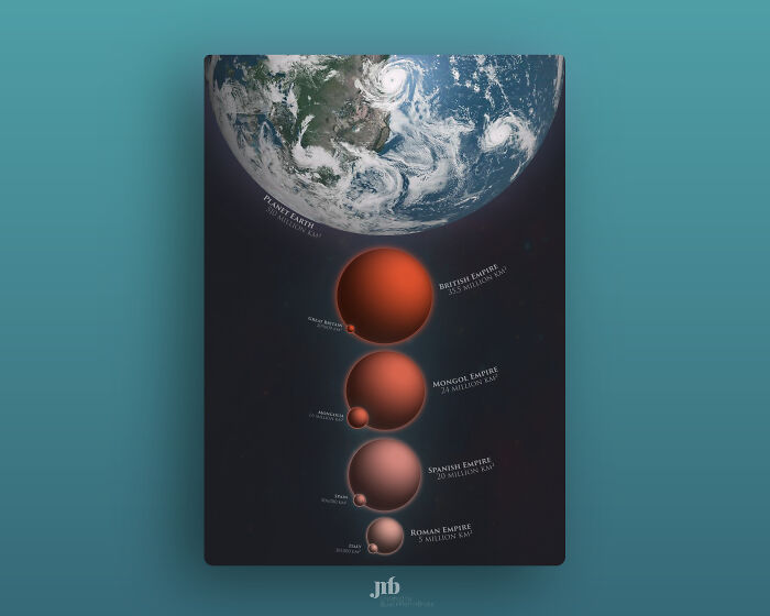
Image credits: jmerlinb
#27 Most Common Themes Of 8000 Picasso Paintings, Visualised In The Style Of Picasso
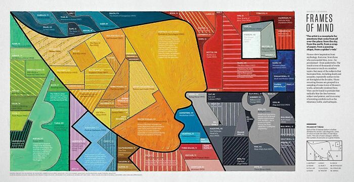
Image credits: jmerlinb
#28 From Flowing Data. Coral-Like Cities To Show Road Networks
Image credits: redflavormp3
#29 I Made A Bar Graph Of My Favorite Quarantine Beers
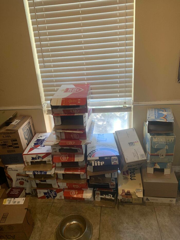
Image credits: reddit.com
#30 Real Proportions Of All Land Masses Revealing Actual Areas Of Countries, Territories And Major Islands Without Any Distortions (By Art.lebedev)
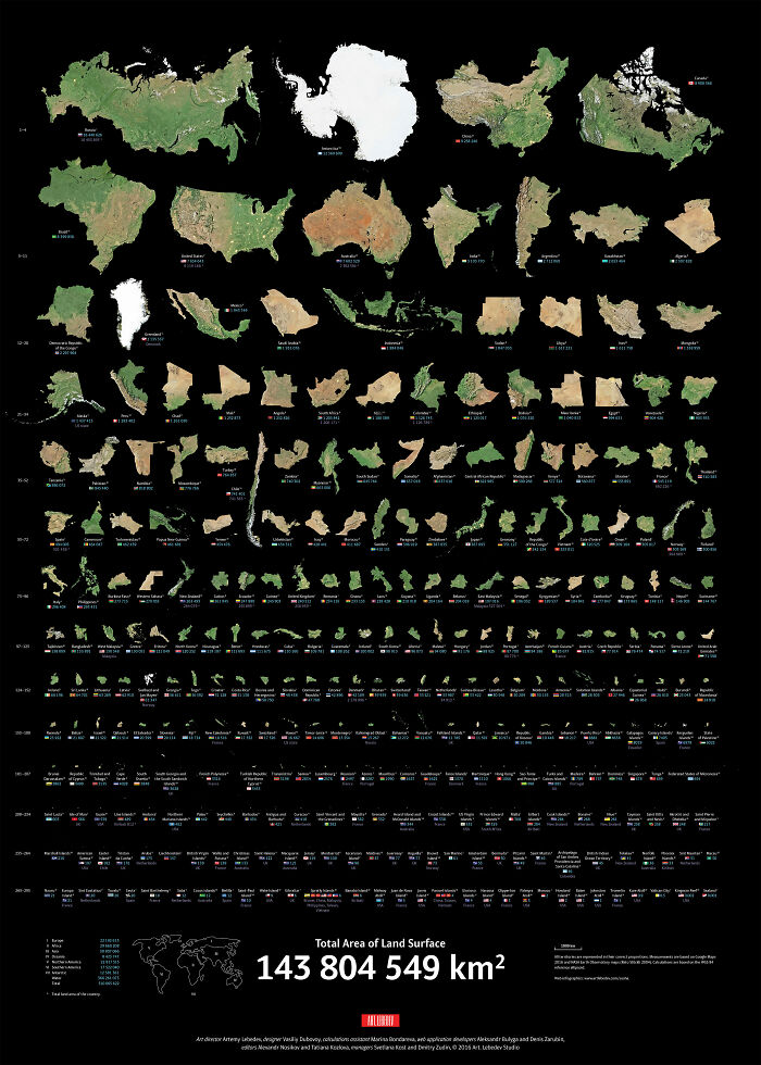
Image credits: notthomyorke
#31 [oc] Words For “Mother” Descended From A Common Proto-Indo-European Root
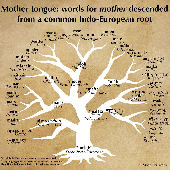
Image credits: UWillAlwaysBALoser
#32 Worldwide Earthquake Density 1965-2006 [oc]
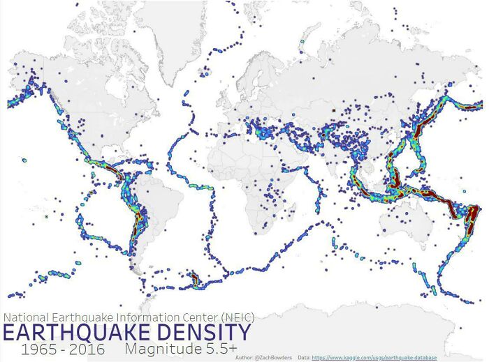
Image credits: Crash_Recovery
#33 The Sentiment Scale: How Positive Or Negative A Word Sounds
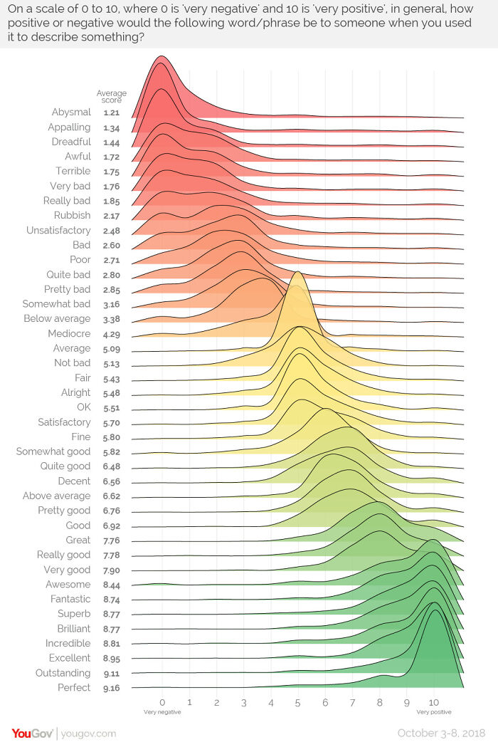
Image credits: Fubai97b
#34 Harmonic Series [oc]

Image credits: reallymeannuns
#35 How Long Animals Live – The Lifespan Of 50 Animals Visualized On A Spiral
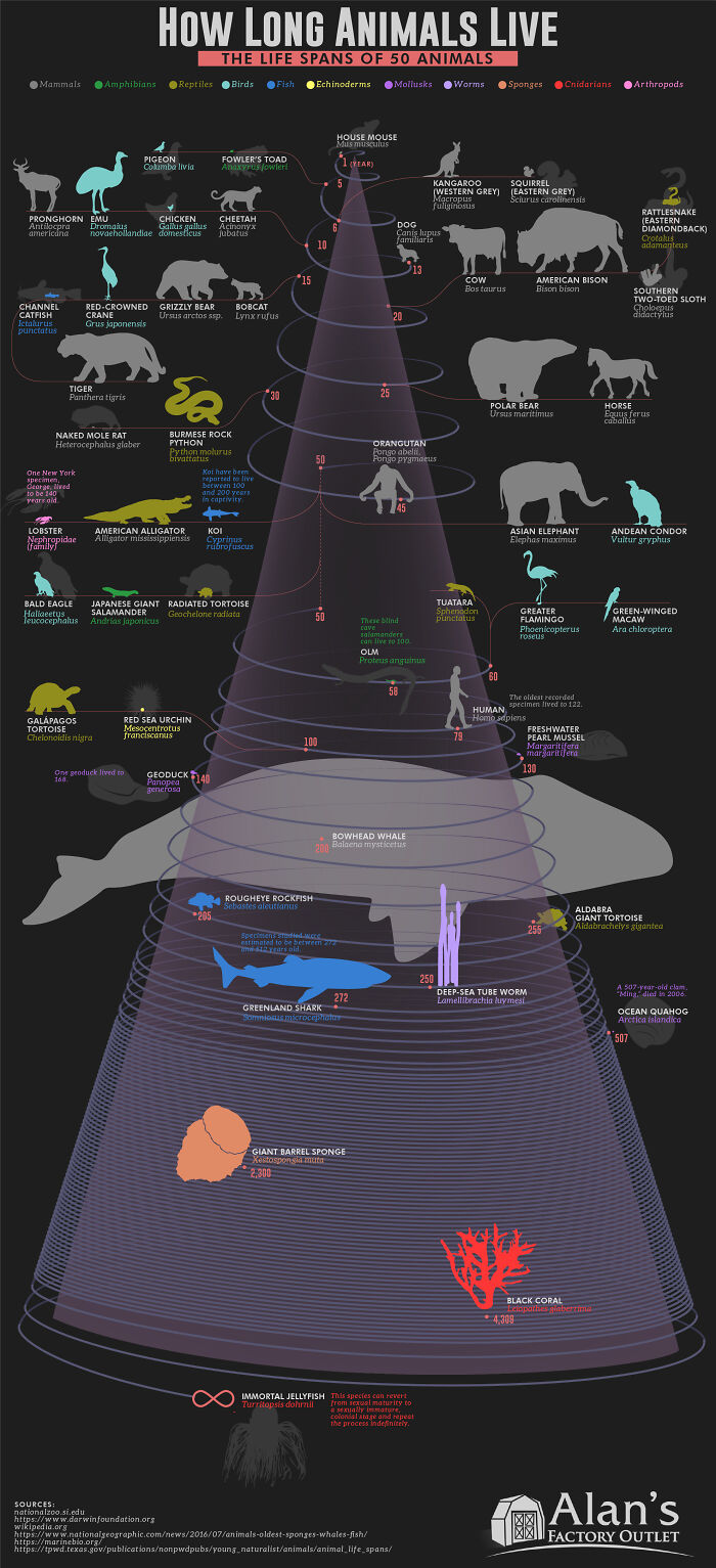
Image credits: FoxyFoxMulder
#36 Abstract Art Visualising California Topography

Image credits: KRANKARTA___
#37 How Old Are The Women Of Mambo Number 5? [oc]

Image credits: Crash_Recovery
#38 Morse Code Guide By Google
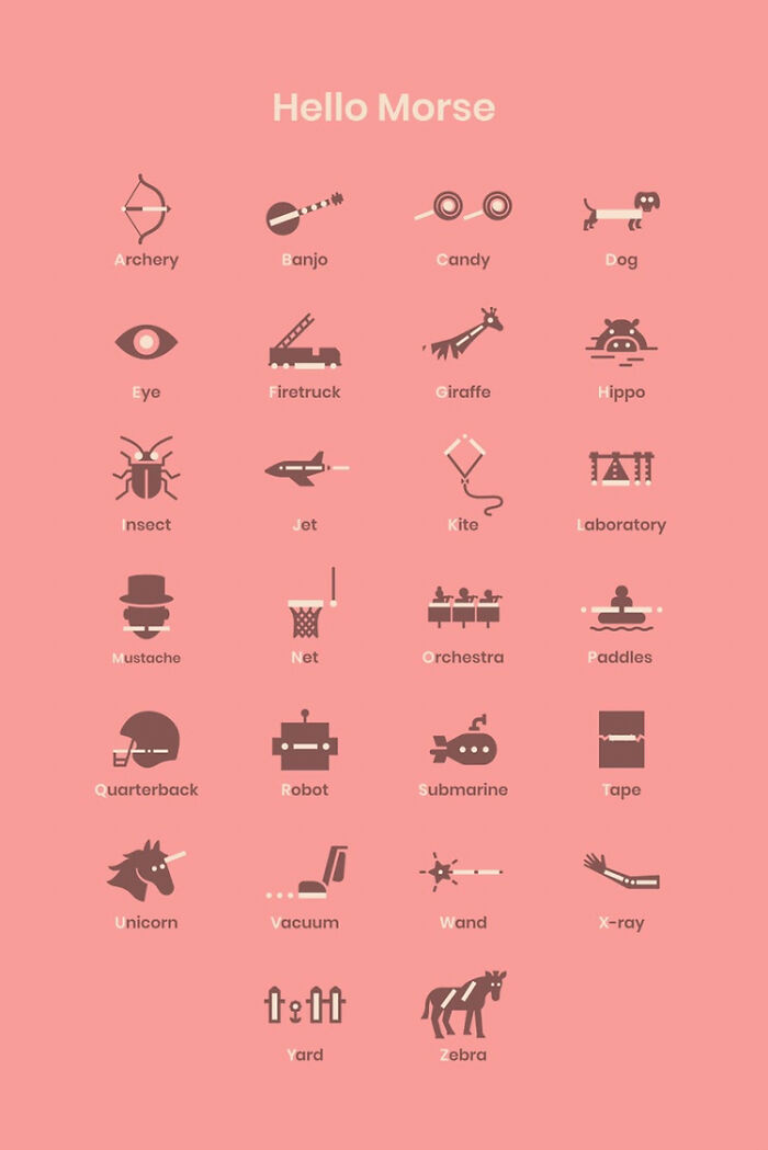
Image credits: 11irondoggy11
#39 I Drew Every Icon I Saw In A Single Day

Image credits: ptgorman
#40 [oc] My Wife Made This Blanket That Indicates A Certain Temperature For Every Day Of The Year. 2016 Pennsylvania

Image credits: jmerlinb
#41 A Laser-Mapped History Of The Mississippi River

Image credits: reddit.com
#42 Mars: Mapping The Geology Of The Red Planet

Image credits: jmerlinb
#43 Temperature Log Blanket Made By My Mother From January 1st 2020 To December 31st 2020

Image credits: AndThereWasNothing
#44 Map Of India From All Its Roads

Image credits: Onion_Leaf
#45 The Colors Of “2001: A Space Odyssey” (1968)

Image credits: julekca
#46 Map Of Current Time Zone Borders

Image credits: twenytwelve
#47 Remoteness

Image credits: Van_ae
#48 I Made This Poster After Researching The Origins Of Santa Claus

Image credits: puddelles
#49 The Globe Centred On Honolulu – Topographic Map From A Single Spiral Line
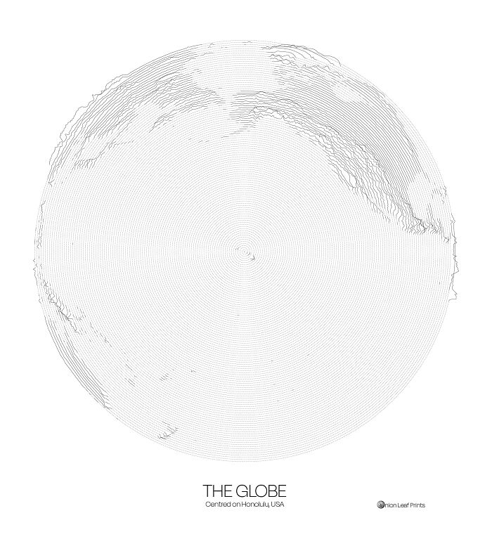
Image credits: Onion_Leaf
#50 Us Elevation Tiles: Would Definitely Have This As A Poster

Image credits: jmerlinb
#51 The Beauty Of Parking Tickets Issued In Seattle

Image credits: DataVizzdom
#52 The 100 Most-Spoken Languages In The World

Image credits: FruityandtheBeast
#53 This Belongs Here For Sure

Image credits: AJ1809
#54 110 Years Of Australian Temperatures

Image credits: MoonShadw
#55 River Basins In Italy

Image credits: jmerlinb
#56 Women & Men In Football/Soccer

Image credits: Alexander_Varlamov
#57 These Diagrams Show The Paths Traced By Mercury, Venus, Mars, Jupiter And Saturn As Seen From Earth
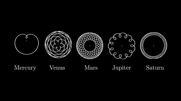
Image credits: Vanilla35
#58 Companies Owned By The Walt Disney Company

Image credits: akasaiga
#59 History Of Pandemics

Image credits: reddit.com
#60 Every Mention Of The 4 Harry Potter Houses, As Featured In The Philosopher’s Stone [oc]

Image credits: jmerlinb
#61 [oc] Visual Studio Code – Monthly Code Changes By Hour

Image credits: jwpalmer
#62 I Transformed The Org Chart Of The Company I Work For Into An Art Piece

Image credits: kikohs
#63 Avatar: The Last Airbender | First Episode [oc]

Image credits: mattindustries
#64 Map Of The Great Lakes With Depth

Image credits: jmerlinb
#65 [oc] Music Industry Revenue By Format ’73 – 2019

Image credits: Crash_Recovery
#66 Color Matters – Visualizing Colorblindness [oc]

Image credits: Crash_Recovery
#67 The Number Of Times The Narrator Of Moby-Dick Says “I”, By Chapter

Image credits: ptgorman
#68 A Movie Barcode Showing The Difference In Color Between The First And Last Harry Potter Movie!

Image credits: sq-jjseabra
#69 1920s Map Of Australia And Its Vegetation Zones

Image credits: jmerlinb
#70 What Countries Spend On Healthcare vs. Military Around The World

Image credits: JingleheimerThe3rd
#71 Evolution Of The Shanghai Metro

Image credits: jmerlinb
#72 Evolution Of Crayola

Image credits: jmerlinb
#73 I Made This Poster From My Whatsapp Chat Analysis With My Girlfriend Over The Years. Finally Gave It To My Her Past Weekend

Image credits: OuijaSpirit
#74 3D Surface Produced From Wind Speed Data Over At 100m Altitude Over The Continental Us

Image credits: fluffybuddha
#75 The Genres Of Shakespeare’s Plays He Wrote Throughout His Career

Image credits: dthains_art
#76 [oc] I Made A Star Wars Expanded Universe Data Artwork Based On Wookieepedia

Image credits: kikohs
#77 [oc] Central London, Colored By Street Orientation

Image credits: UWillAlwaysBALoser
#78 The British Empire, At Its Territorial Peak In 1922, Covered Nearly The Same Surface Area As The Moon [oc]

Image credits: jmerlinb
#79 Elevation Lines Of Oahu Island, Hawaii

Image credits: Alexander_Varlamov
#80 Thought You People Might Appreciate This!

Image credits: SleazyJusticeWarrior
#81 [oc] 10 Years Of Tesla Stock Prices

Image credits: dhaitz
#82 Candle Fire Graph Made Of Candles

Image credits: bcookie319
#83 Population Density Of India Shown In 3D

Image credits: NabeelNazer_7
#84 This Developer’s Heat Map Of Apex Legends

Image credits: Mattosauruss
#85 Map Of Night Trains In Europe

Image credits: funzen26
#86 Topographic Colorado Flag

Image credits: newishtodc
#87 Four Famous Earthquakes Visualised Through Recorded Ground Motions

Image credits: GrumpyGeologist
#88 Timelines Of Average Color Of Frames Of 2020 Academy Awards Contenders

Image credits: admie
#89 Age Of The Buildings In Paris [oc]

Image credits: bjperson
#90 Here Is What The Conservative Leadership Contest (UK) Looks Like On Twitter [oc]

Image credits: Leelum
#91 All Bitcoin Ever Spent

Image credits: wordsarehelpful
#92 Indian Railway Network Visualized By Stations

Image credits: lordDummy
#93 The Solar System Map (Showing *very Rough* Locations Of Celestial Objects)

Image credits: jmerlinb
#94 I Draw A Line From The Centre Of The UK To The Centre Of Every Other Country On Earth, Then Coloured Them By Their Position On A Compass [oc]

Image credits: jmerlinb
#95 Abstract Art Visualising Arkansas Topography

Image credits: KRANKARTA___
#96 Madrid’s Roads, Colored By Designation

Image credits: cremepat
#97 Hot Spots Of Shots By Popular Nba Players

Image credits: Alexander_Varlamov
#98 Evolution Of The Population Of Belgium [oc]

Image credits: jere1110
#99 Coronavirus Infection Map (Link In Comments)

Image credits: Janman14
#100 August 2019 Is Continuing An Active Amazon Fire Season, With Large And Intense Fires Burning In The Region. Nasa Satellites Tracked Actively Burning Fires Across South America And Captured Images Of Smoke In The Last Week

Image credits: akasaiga
#101 114 Dog Breeds Ranked By Temperament

Image credits: Sy3Zy3Gy3
#102 Our Eroded Mental Health Care System [oc]

Image credits: kateschaub
#103 I’m Trying To Recreate The First Paper Ever To Simulate A Black Hole Image (Luminet, 1979) In Python. This Is One Of My First Results. Values Of E/L (Energy / Angular Momentum) Of Photons Emitted At A Fixed Radius From A Spherical Black Hole

Image credits: Narcotle
#104 Movie Colour Barcodes Of Studio Ghibli Films: Each Horizontal Line = The Dominant Colour Of A Single Frame

Image credits: jmerlinb
#105 [oc] Marvel Character’s Team Membership

Image credits: Crash_Recovery
#106 City Constellations: The 5 Largest Cities In Each American State, Mapped

Image credits: ptgorman
#107 Radix Sort

Image credits: reallymeannuns
#108 Every Frame From Each Star Wars Film Displayed In A Disk. The Opening Frame Is At The Border Of The Disk, The End Credits At The Center

Image credits: tyty51404
#109 Most Prominent Colours Appearing In Official Presidential Portraits Of The Past 16 Presidents

Image credits: jmerlinb
#110 Heatmap Of The Most Changed Pixels On R/Place

Image credits: jmerlinb
#111 % Of Your Life The United States Has Been At War, By Birth Year

Image credits: reddit.com
#112 Frameworthy Baseball Data

Image credits: adyo4552
#113 Every Color Mentioned In The Book Infinite Jest

Image credits: ptgorman
#114 Regional Managers Of Dunder Mifflin Scranton By Episode Of The Office

Image credits: BoMcCready
#115 Every Nfl Team’s Relocation (Oc)

Image credits: fiftythreestudio
#116 Inspired By Recent Blade Runner Barcode – Both Films Together [oc]

Image credits: Rick_Proza
#117 Abstract Art Visualising Colorado Topography

Image credits: KRANKARTA___
#118 Recreating Lenore Tawney’s 1964 Drawing ‘Reflected Ray’ In Ggplot And Ggpomological [link In Comments]

Image credits: twoy519
#119 Avatar Season 1 [oc]

Image credits: mattindustries
#120 Beautiful Chart Of The Counter For Almost Every Character In Overwatch! Done By: Nekoryuk For The Metabomb.net Article. Research Comes From John Bedford In His Overwatch Counters Articles (There Are A Few Missing And This List May Not Be Accurate For The Current 2020 Meta)

Image credits: MistaNicks
Source: boredpanda.com