

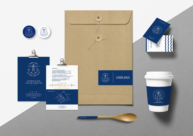
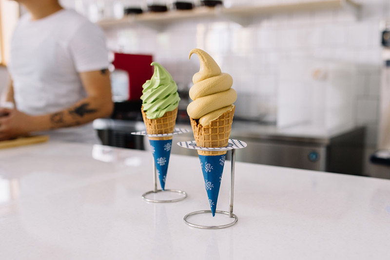
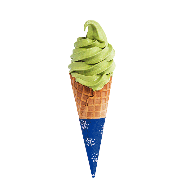
KINBER MADE’s brand identity is based on the key visual of ice cream in the form of a beacon on top of a lighthouse. The company was founded in Taichung in 2014 with the aim to offer ice cream made with natural ingredients in good faith like a lighthouse, guiding every friend who loves desserts and food, to find this unique happy taste and experience.
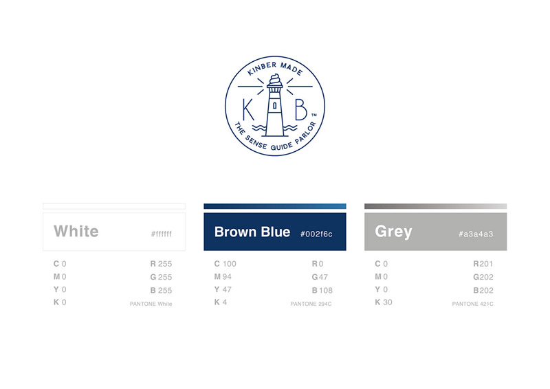
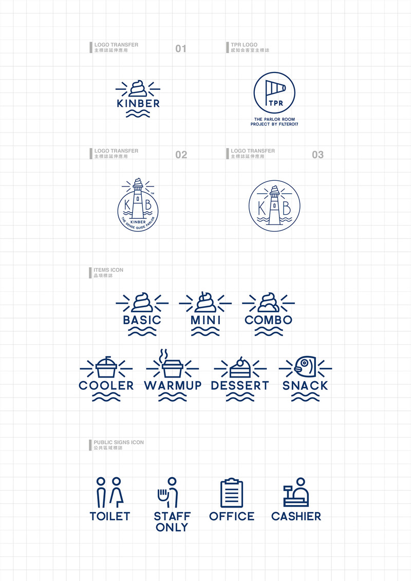
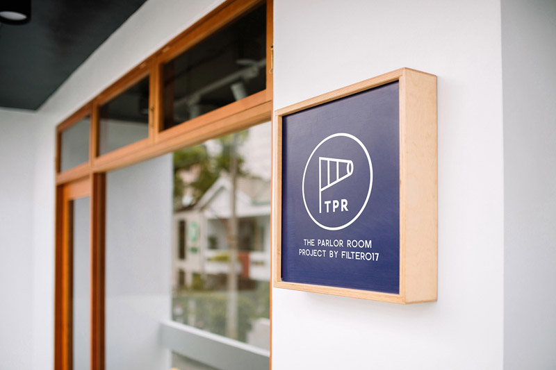
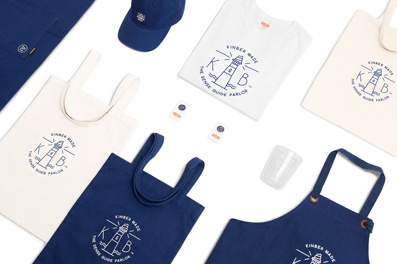
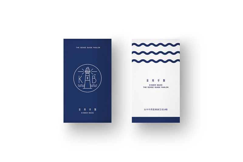
ChinYan C and Enzo Lin of graphic design and branding studio Filter017 have been working on a uniform and unique visual experience including logo, stationery, communication and promotional materials as well as the new shop interior. Below you can find a few images of their amazing work.


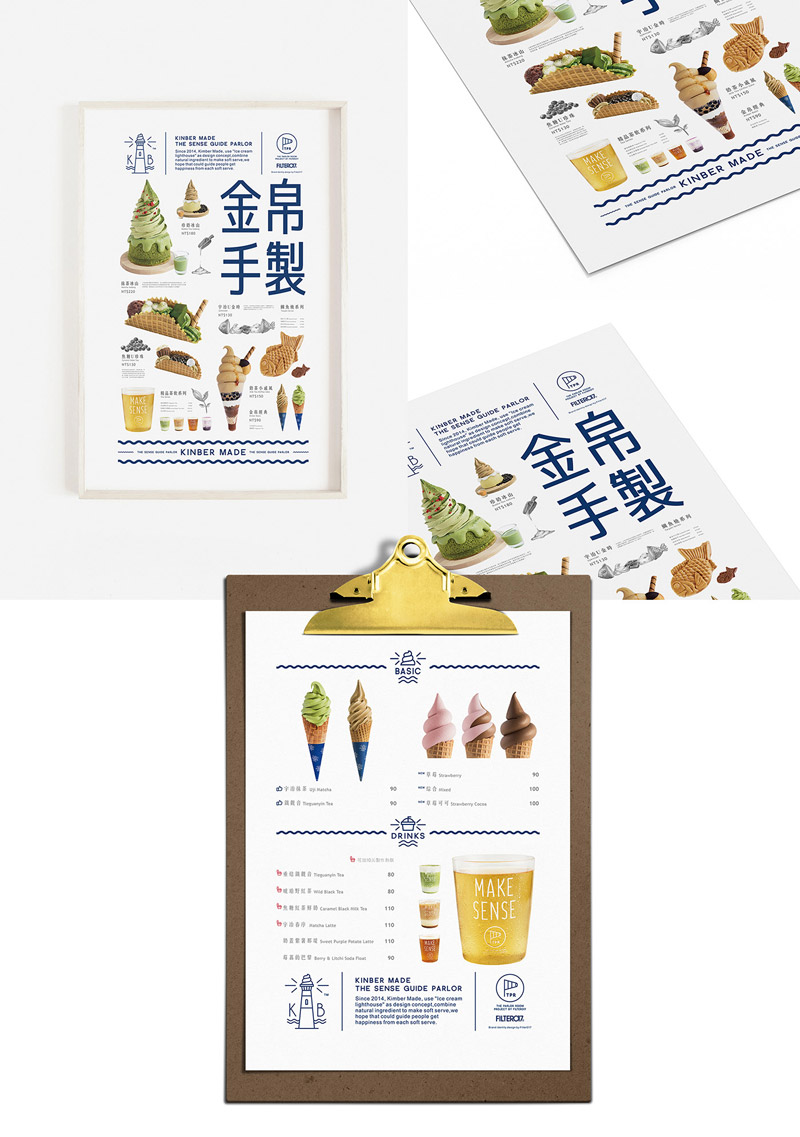

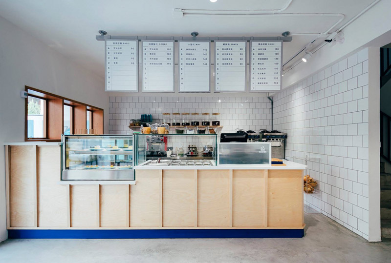
All images © by Filter017. Feel free to check out our Graphic Design and Branding categories to find other inspiring work.
Subscribe to our newsletter!
The post KINBER MADE Branding by Filter017 appeared first on WE AND THE COLOR.
Source: weandthecolor.com