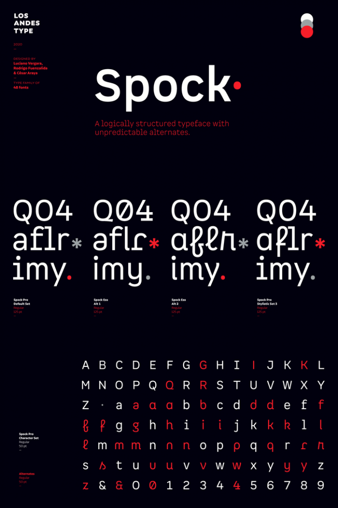
Spock, a neutral and structured font family that comes with a rich variety of alternates.
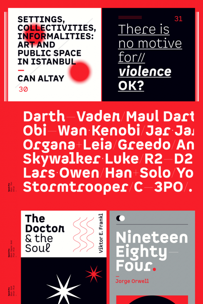
Designed by Luciano Vergara, César Araya, and Rodrigo Fuenzalida for foundry Los Andes, Spock is a new sans serif font family that comes with lots of unique typographic features. The Spock font family is based on a neutral and clean structure but with a rich variety of alternates—even glyphs with pointed ears. This way, it’s a great typeface for a wide range of graphic design projects.
Each of Spock’s four sub-families consists of 6 weights plus matching Italics. Consisting of 48 styles in total as well as a generous number of alternates, this super-family is a true workhorse for plenty of typographic applications. Just click on the following link to find out more.
Listen beautiful relax classics on our Youtube channel.
Do not hesitate to check out other recommended typefaces in our extensive Fonts category. In addition, you can find professional graphic design resources in our Templates section.
Subscribe to our newsletter!
The post Spock Font Family by Los Andes appeared first on WE AND THE COLOR.
Source: weandthecolor.com